Content with poor readability scores (the ease for prospects to read the words in your message) stands between you and content marketing success.
With so many competing messages available just a click away, our print and online messages must be as easy to read as possible.
Readability is not only for formal publications like annual reports or four-color brochures. All of our content marketing messages should be easy to read.
Here are seven easily implemented design tips for easy reading.
Your readers aren’t reading!
When your eyes met the word “instantly,” such as, your brain didn’t “sound out” the letters i, n, s, t, a, n, t, l, y. Instead, your brain recognized the distinctive shape of the word — i.e., its outline — and assigned it a meaning.
After “decoding” the first group — or cluster — of words, your prospect’s eyes jumped to the next group, and then the next, making their way across and down the page.
Serial pattern recognition, the process described above, has significant implications for the way we design and lay out our content marketing messages.
Here are some simple steps you can take to improve t
he readability of both “everyday” word-processed documents, as well as check the design of “formal” content marketing projects such as eBooks, reports, and white papers.
Although intended primarily for print publications, the following tips are applicable to projects intended for online reading.
How to increase your content’s readability
1. Give text room to breathe:
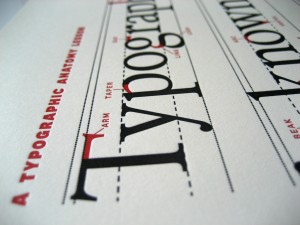
Pay particular attention to line spacing. Provide enough inter-line spacing, or leading, to make it easy for your readers to recognize the distinctive shapes created by the letters in each line. Add extra line spacing beyond the default, or suggested, line spacing your word processor or page layout program suggests. Provide enough white space above and below each line to highlight the ascenders (the parts of characters that stick up, like “T” and “I”), and the descenders (or parts of letters that extend down, like the tails of “y” and “g”).

2. Use uppercase type with care:
Headlines and subheads set entirely in capital letters slow your readers down because they are harder to recognize — there are no word shapes! (They also take up more space than words and phrases that combine uppercase and lowercase type.) Although words set entirely in uppercase text are proper for titles and logos, they are less correct inside your reports and white papers.
3. Avoid long lines of text:
Long lines of type (i.e., lines of type that extend from the left-hand to right-hand margins of a page) are fatiguing to read because the reader’s eyes have to make multiple jumps from word group to word group across the page. Worse, long lines of type increase the chance that readers might get lost at the end of a line, and either reread the same line (called doubling) or accidentally jump down two lines and lose the idea you’re discussing.
4. Build contrast into each page:
Two ways can keep readers engaged and guide them through your message. When laying out your pages, build white space into each page by using a multi-column format. A popular alternative is to combine a narrow column of white space with a wider text column. Then, add typographic contrast by using headlines and subheads that are noticeably larger or darker than the type used for adjacent paragraphs.
Subheads need to stand out from the paragraphs to guide your readers’ eyes through your paragraphs, announcing upcoming topics.
5. Minimize text wraps:
Minimize anything that can interrupt your readers’ rhythmic, left-to-right eye jumps as they scan your paragraphs. Text wraps occur when a photograph or graphic exists within a text column, reducing the line lengths of the adjacent text. This forces readers to readjust to a different scanning rate, only to have to return to the original rhythm after the interruption.
6. Use short subheads:
Limit subheads to one line. Avoid using full sentences (i.e., subject-noun-verb). Use the least number of words to tease readers into wanting to read the text that follows.
7. Monitor the details:
Edit text to avoid widows and orphans — when words, or sentence fragments, are isolated at the top or bottom of a page or column of text—often, rearranging a couple of words is enough to cut the distraction. Watch out for formatting problems that can cause confusion. Inadvertently splitting a person’s name over two lines, (i.e., first name at the end of one line, their middle first and last name at the beginning of the next line) are enough to distract your readers.
Become a “readability connoisseur”
Train yourself to take a second look at the eBooks, reports, and white papers you meet. When you meet a PDF that projects an engaging, professional image and is easy to read, analyse why you find it engaging and easy to read. Analyse it from the point of view of the seven points described above.
Likewise, when you meet a boring or hard-to-read PDF, try to figure out why it’s hard to read. Check whether text lines are too close to each other and the length of text.
Consider creating a scrapbook of well-executed design projects or, perhaps, consider using Evernote to create an online scrapbook of good and bad examples of readable design.
Design literacy isn’t just for designers! Share the basics of readable design with your staff and freelancers, so that all of your print and online communications — not just the fancy ones — are easy to read and project a professional image.
For more ways to improve the readability and message of your website content for business drop me an email at Justin@StellarDigital.com.au.


0 Comments
You can be the first one to leave a comment.